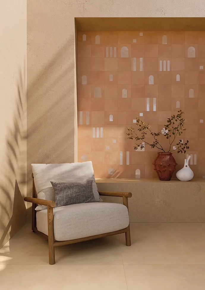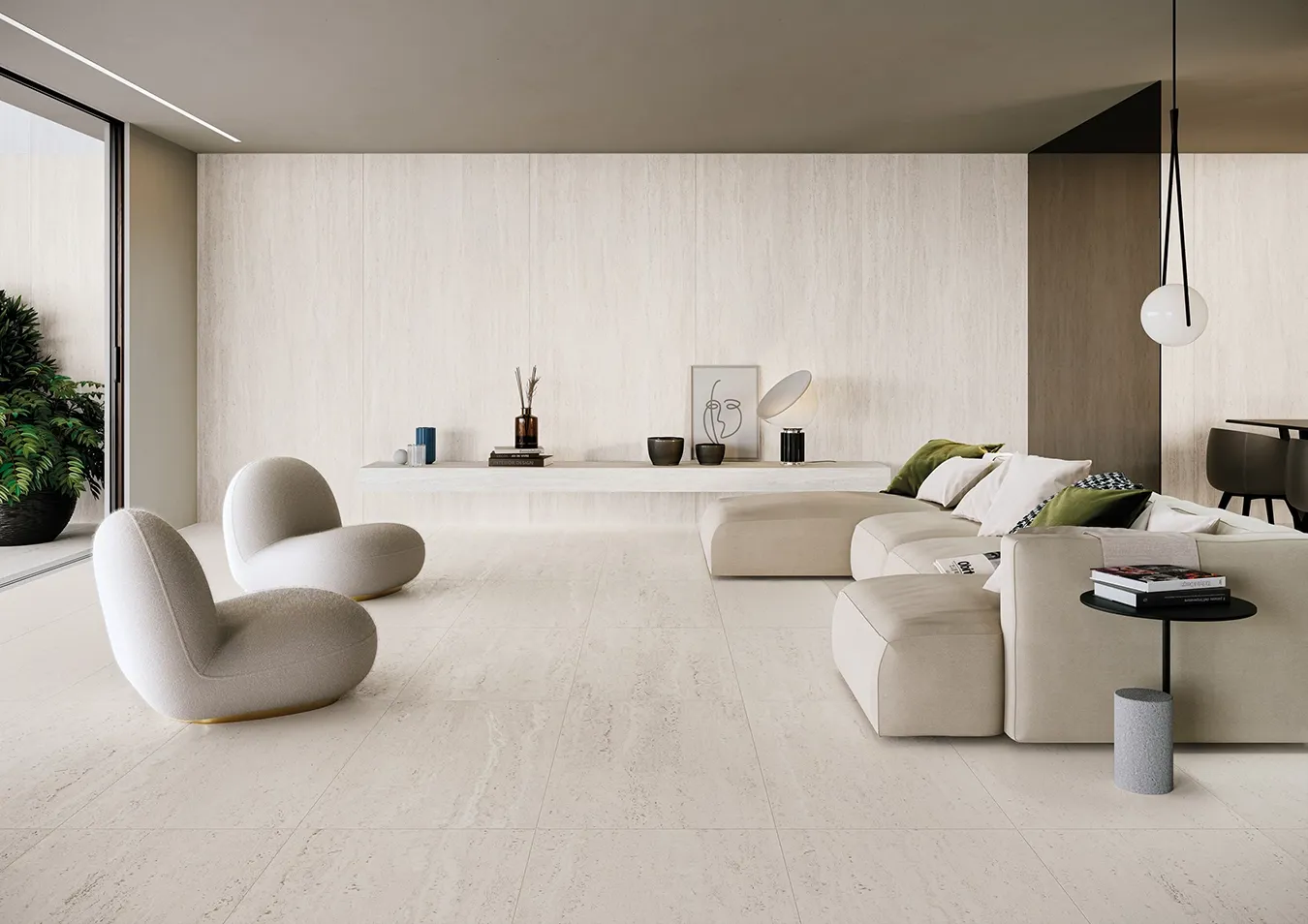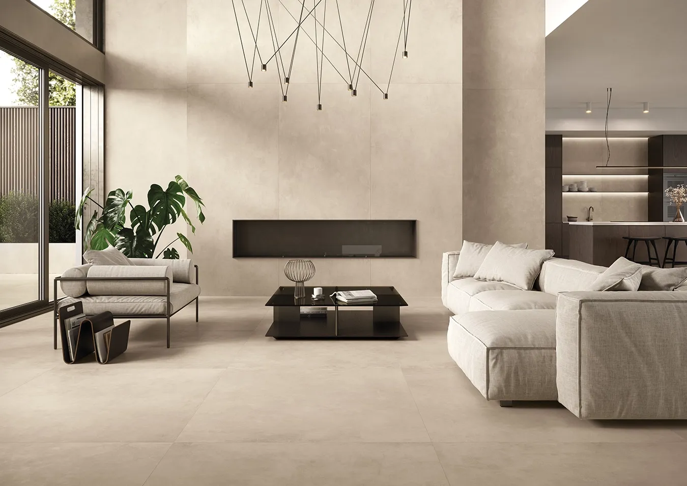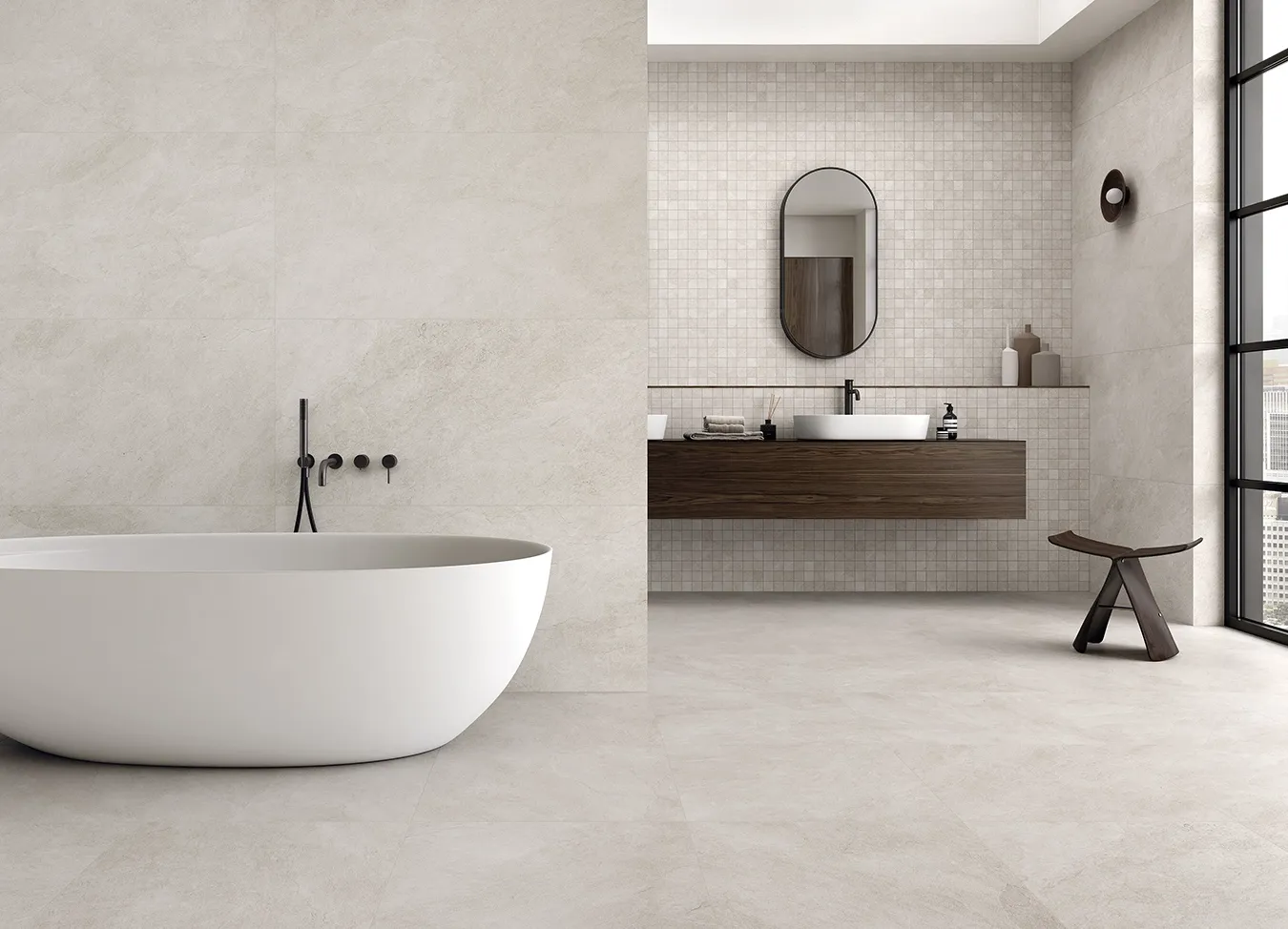


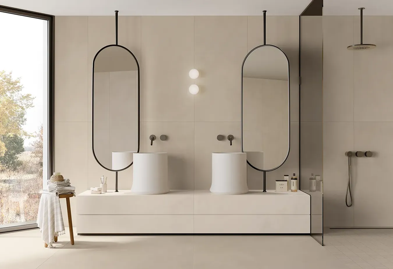


1. The base: sensory neutrals and "Cloud Dancer"
These colors are not just backgrounds, but pillars of brightness. The goal is optical continuity: eliminating sharp contrasts to make spaces appear larger and more fluid.
-
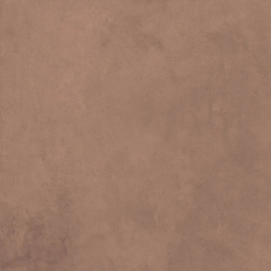
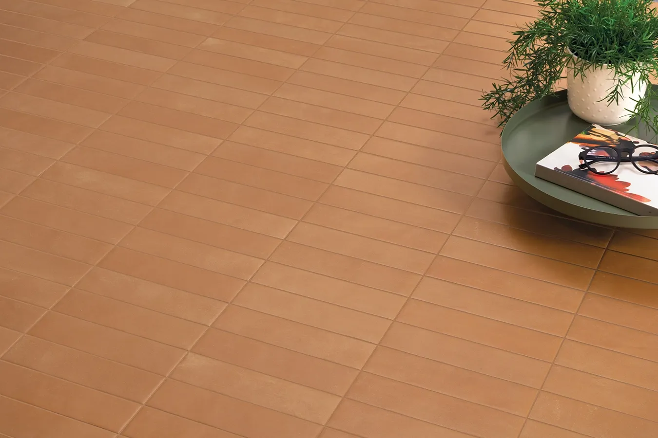
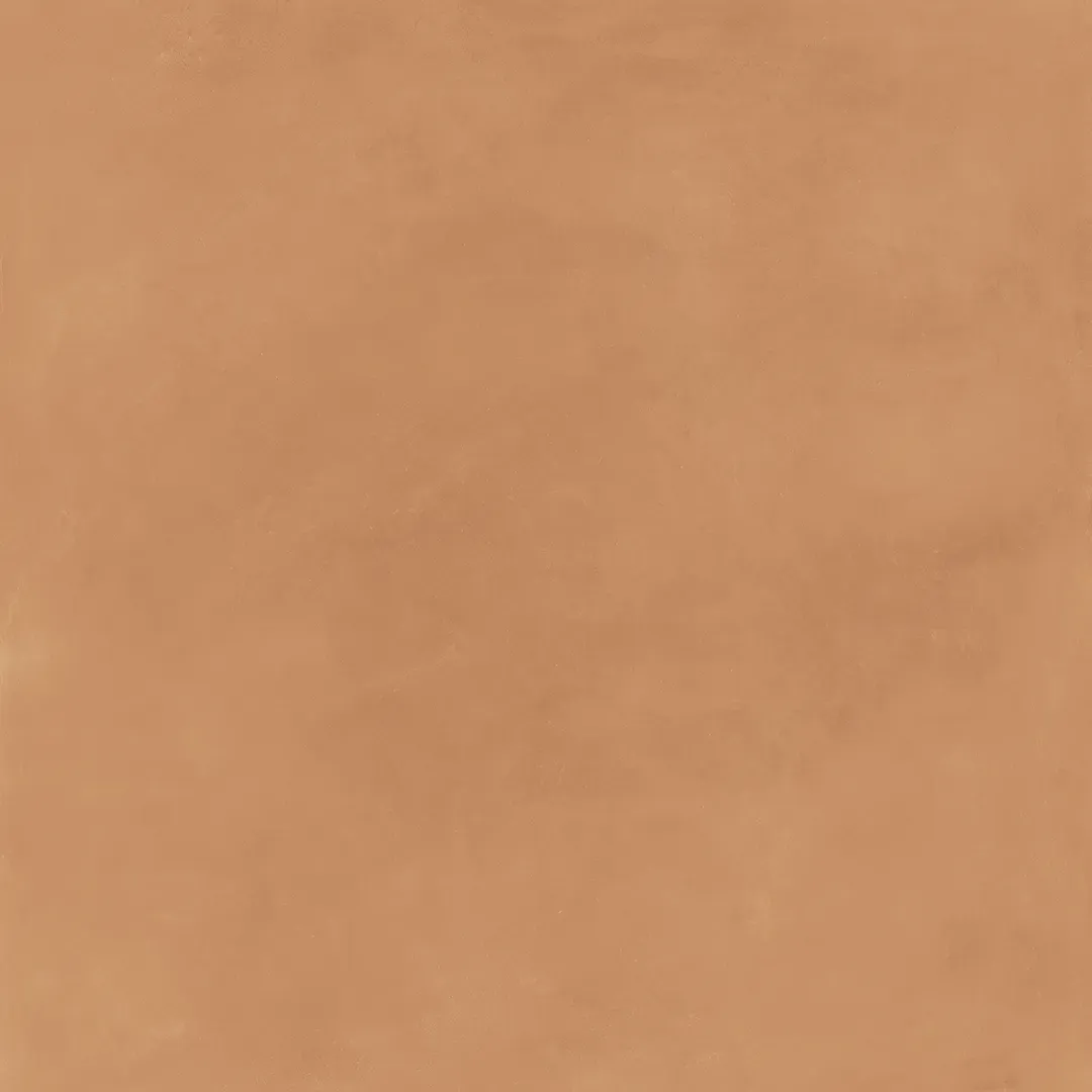
The protagonists: warm ivory, sand, soft white, and greige.
-
The effect: a feeling of "visual softness" that reduces eye strain and amplifies natural light.
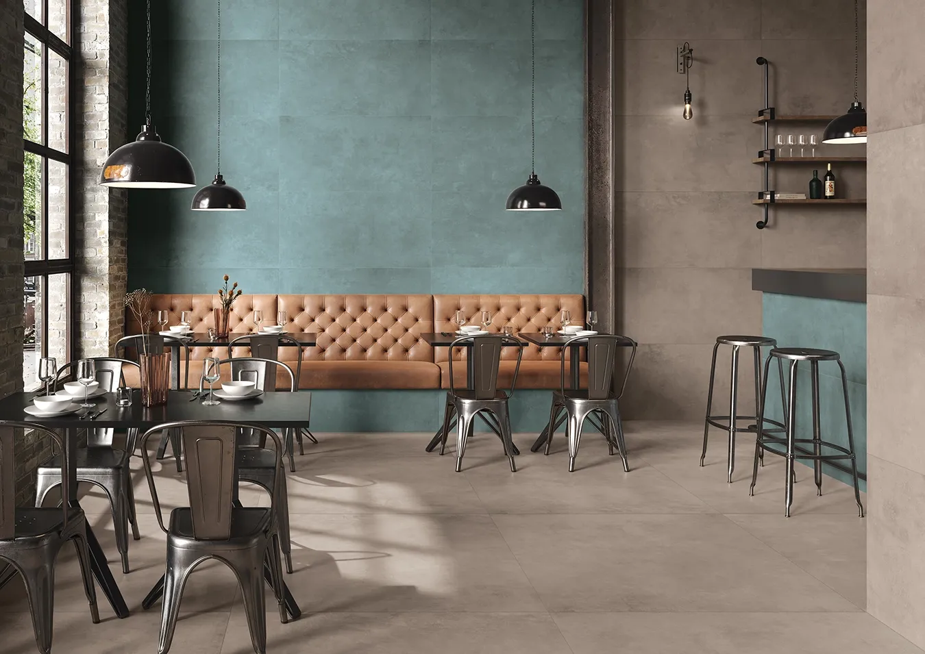
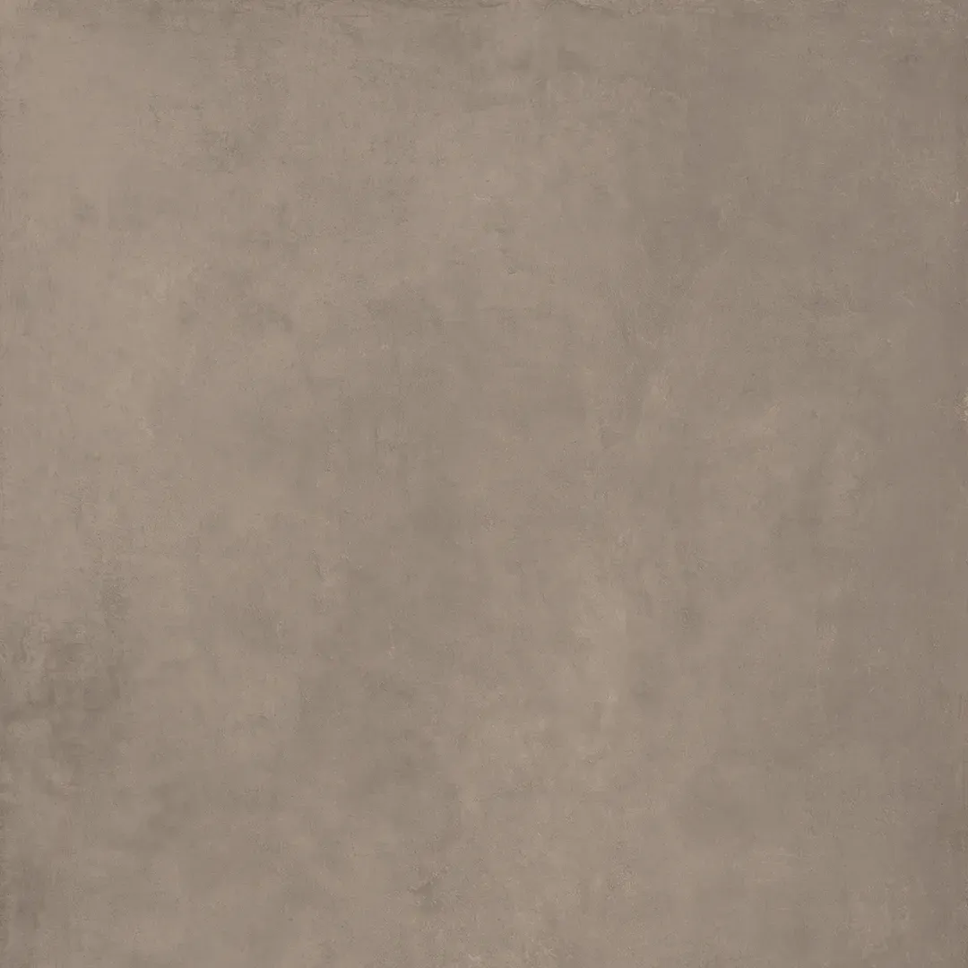
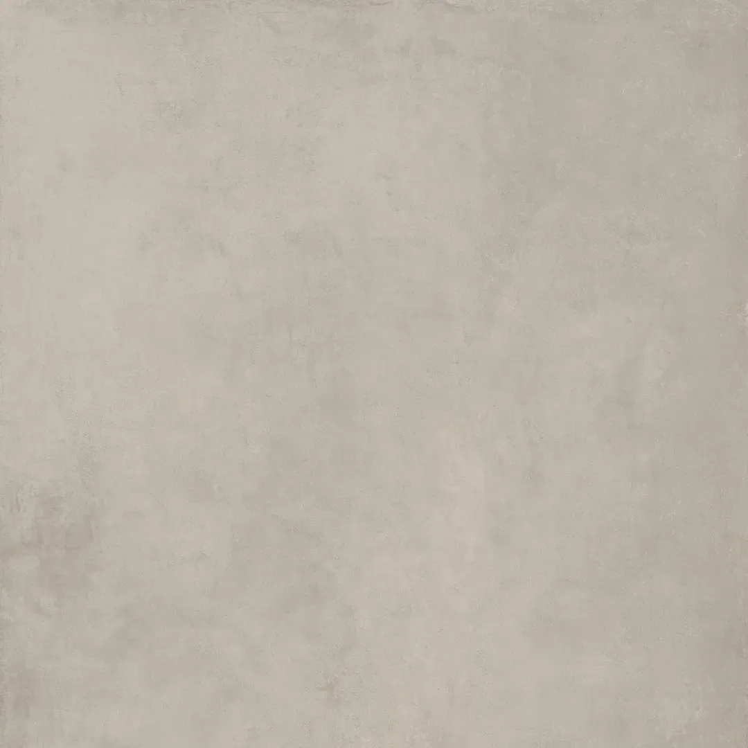
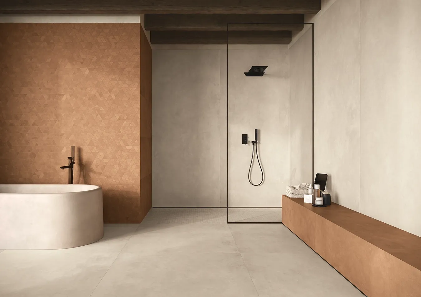
2. The Wild Card: Universal Khaki (Sherwin-Williams)
The Khaki of 2026 is evolving. It is no longer a "military" or flat color, but a variation of organic greige.
- Why it works: thanks to hints of green, it acts as the perfect bridge between artificial neutrals and natural materials (wood, stone, linen). It is the ideal choice for those who want depth without darkening the environment too much.